Background
Hulu Ad Manager (now Disney Campaign Manager) launched as a self-serve ad platform for SMB advertisers. As the business shifted focus to agencies, we added new features such as ad accounts, brands, and multi-user access. But the Admin Portal, used by account managers and support teams, was built with the same navigation model of the advertiser-facing interface experience. It organized everything by type (accounts, campaigns, users) which was backwards from how support teams worked.
Problem
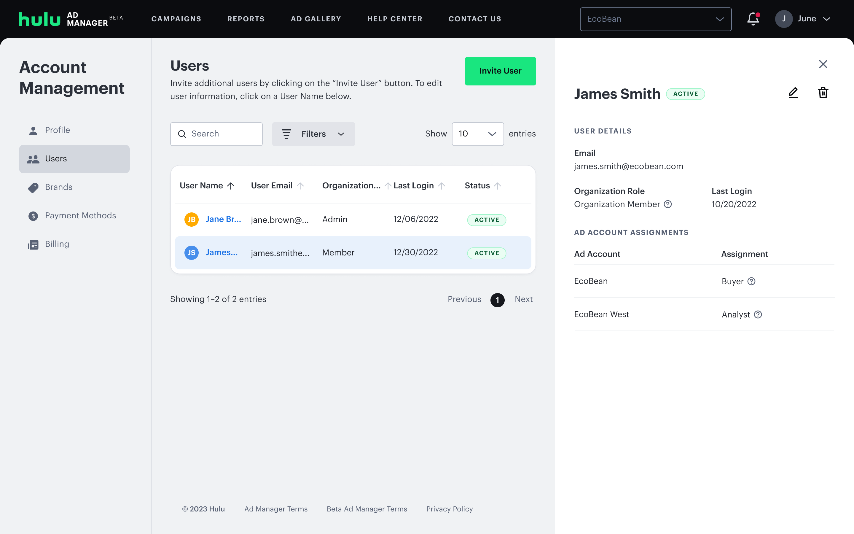
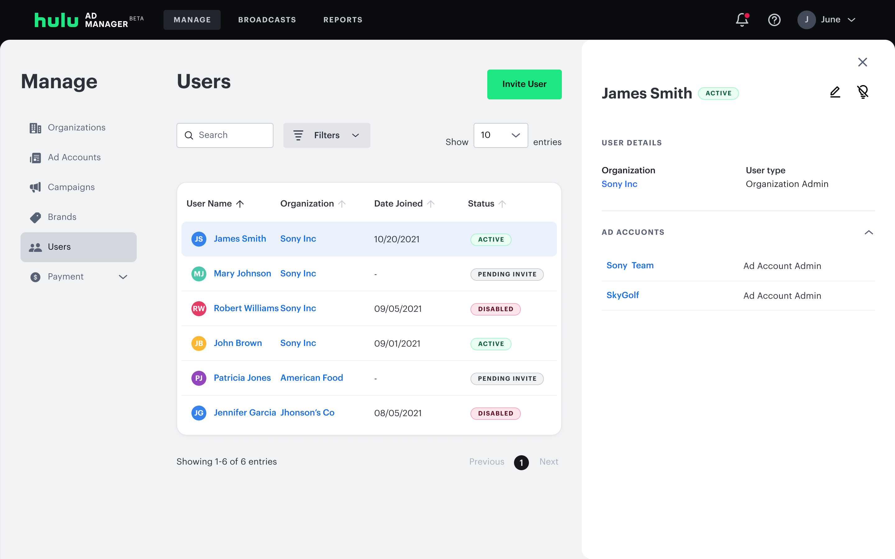
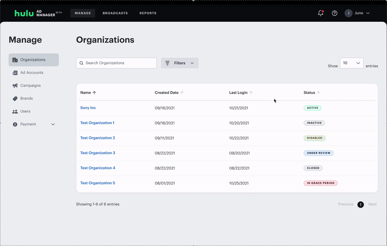
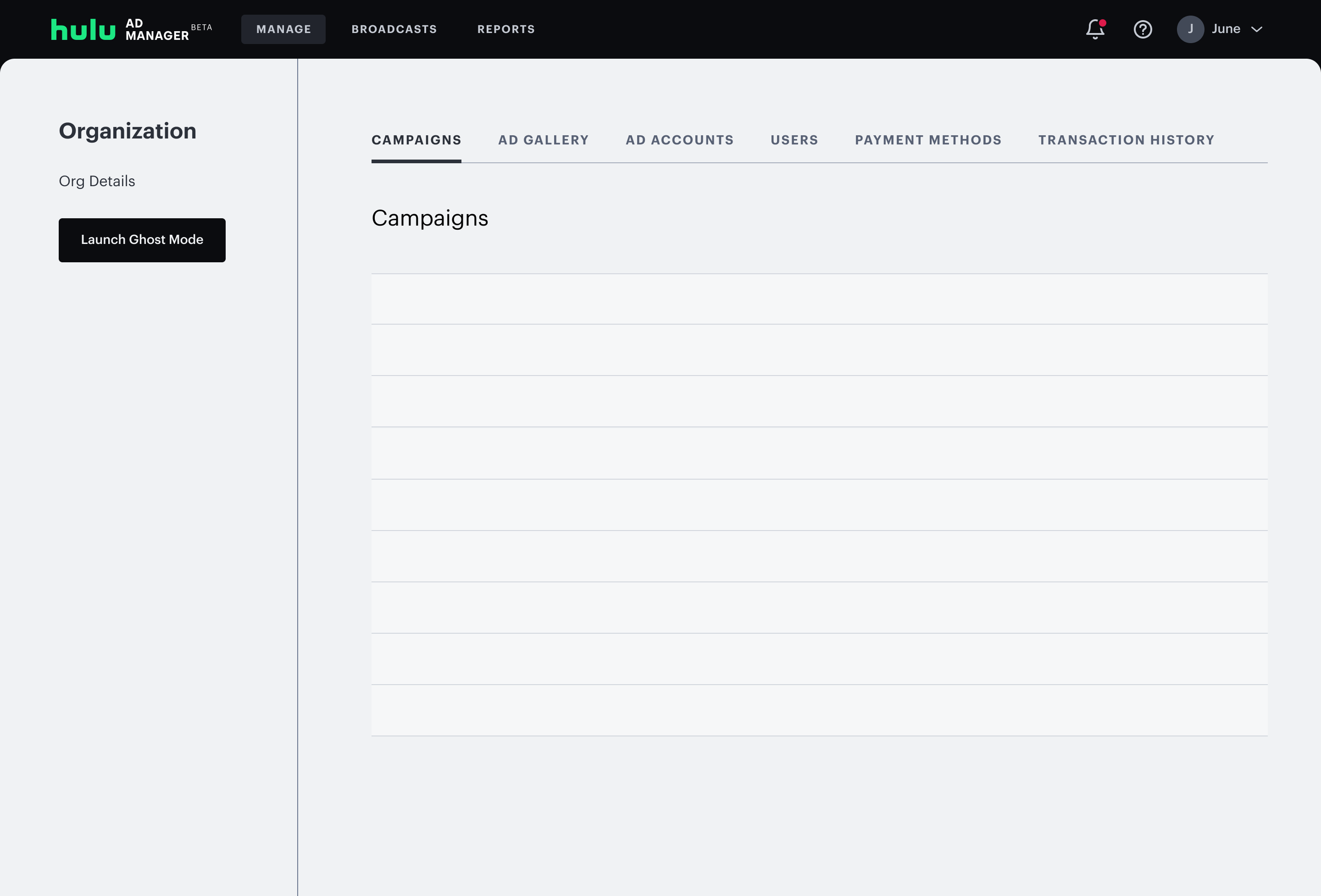
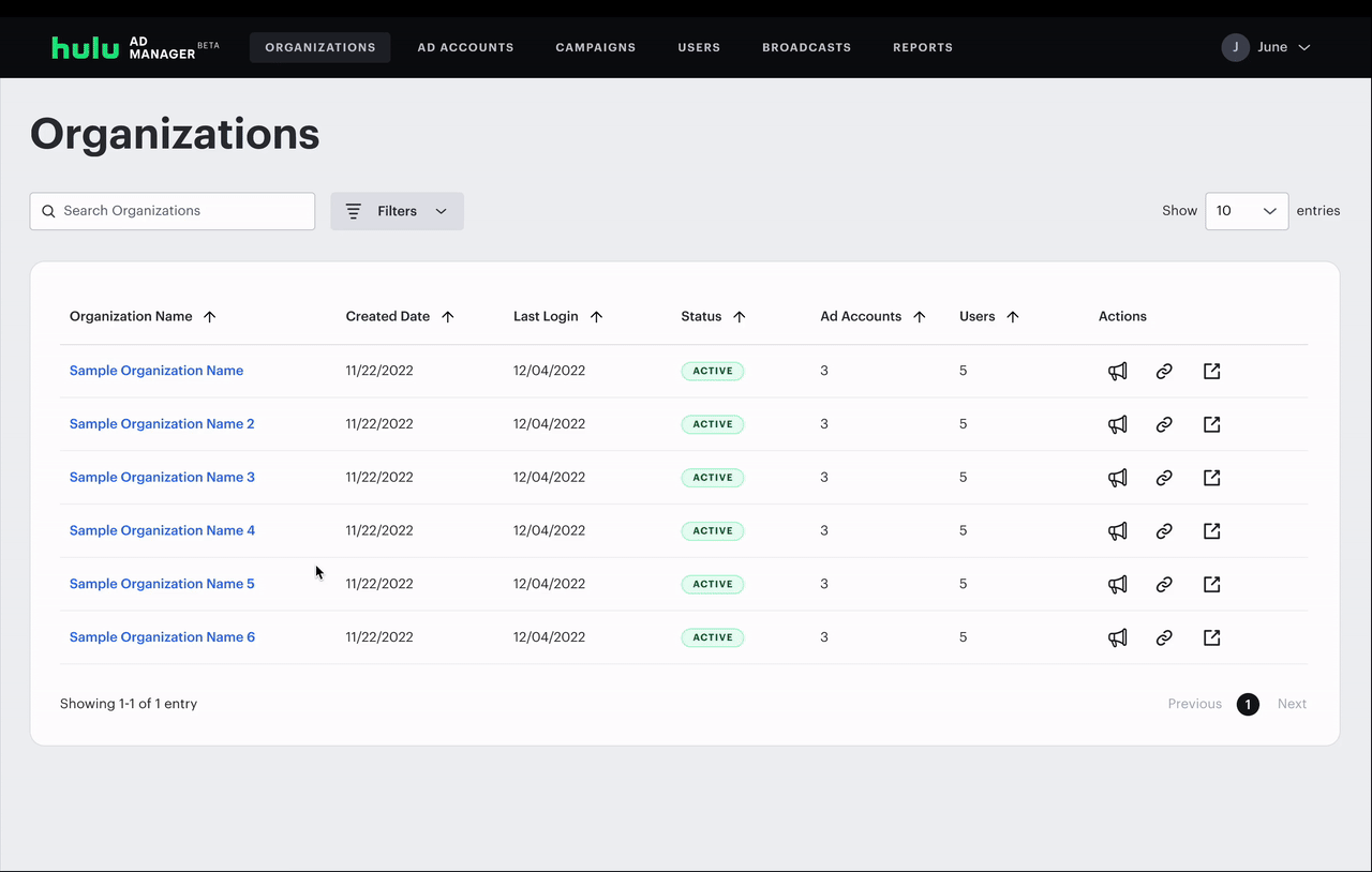
Support's mental model was completely different from an advertiser's. When a ticket came in, they needed to find that specific advertiser, and view all their info. The side navigation organized everything by type: ad accounts, campaigns, users. All ad accounts, campaigns and users would show until you filtered down by advertiser.
The navigation also had unexpected behaviors such as certain links that would redirect to new pages and unexpectedly open side panels, disrupting the flow.
User Interviews
I audited the portal and interviewed account managers, customer support, and escalation teams to understand how they actually worked. Two moments stood out as the clearest signal of how broken the experience was:
Asking advertisers to take screenshots of their own screens and send them over, because there was no way to see the advertiser's view.
Creating dummy advertiser accounts just to recreate issues and understand what was happening.
Most users preferred starting at the organization level and filtering down to a specific advertiser. Finding creatives tied to a campaign required multiple steps with no clear path. And nearly everyone who had used the previous admin layout said they preferred it.
Design Approach
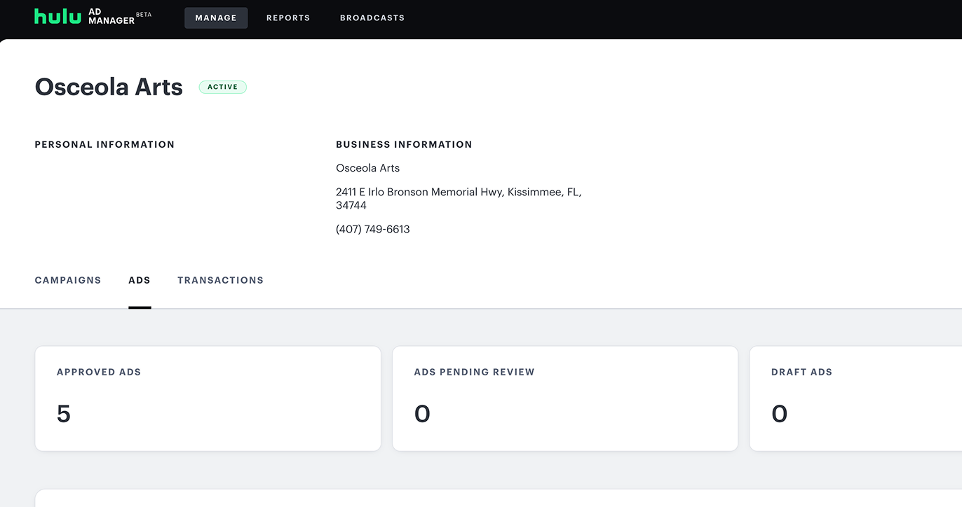
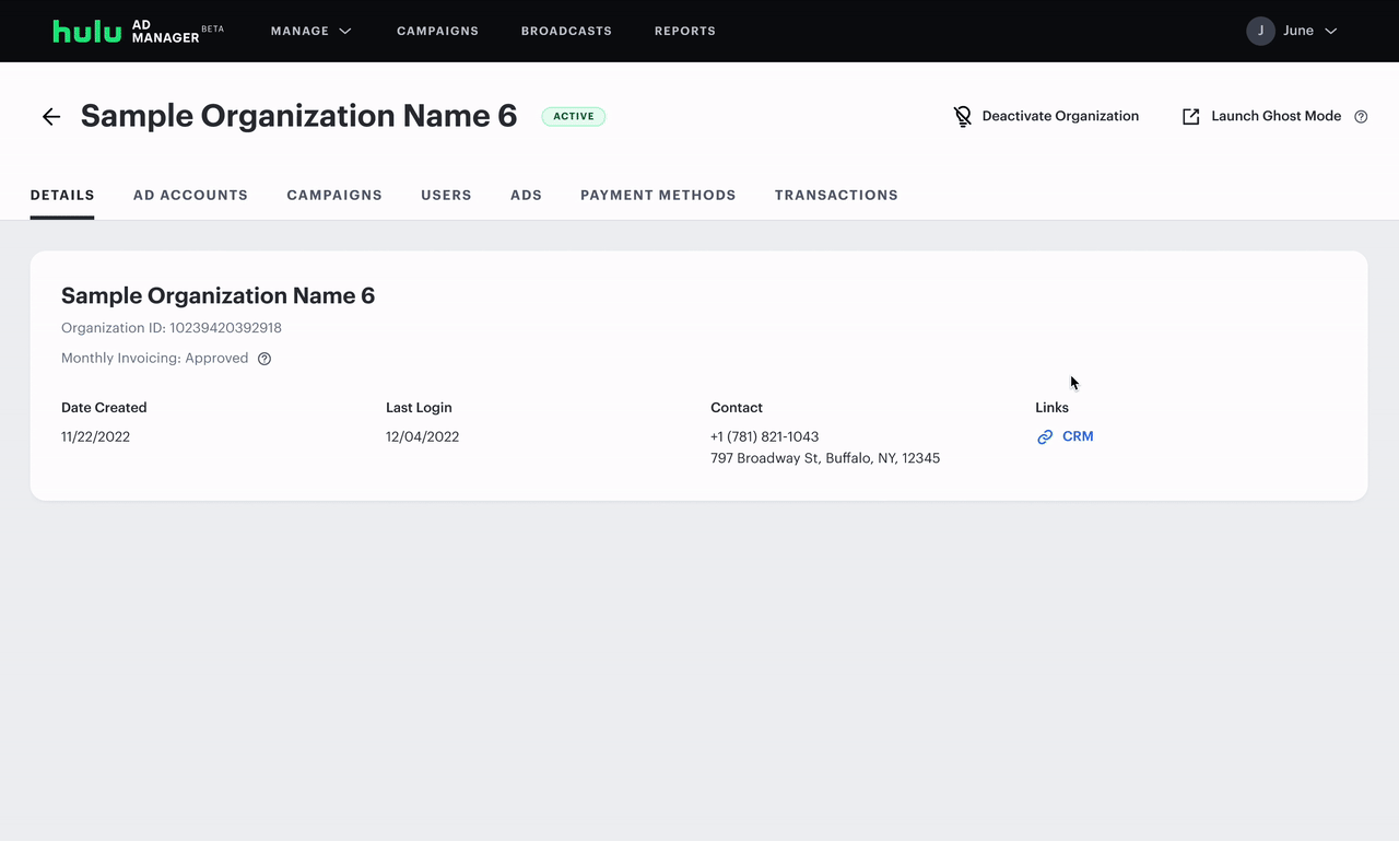
Tabs vs Side Nav
The old admin portal had this right: start with an advertiser, then tab through their campaigns, users, and creatives. The new portal had thrown out that model in favor of consistency with the advertiser-facing interface. My job was to bring it back, updated for the features that now existed.
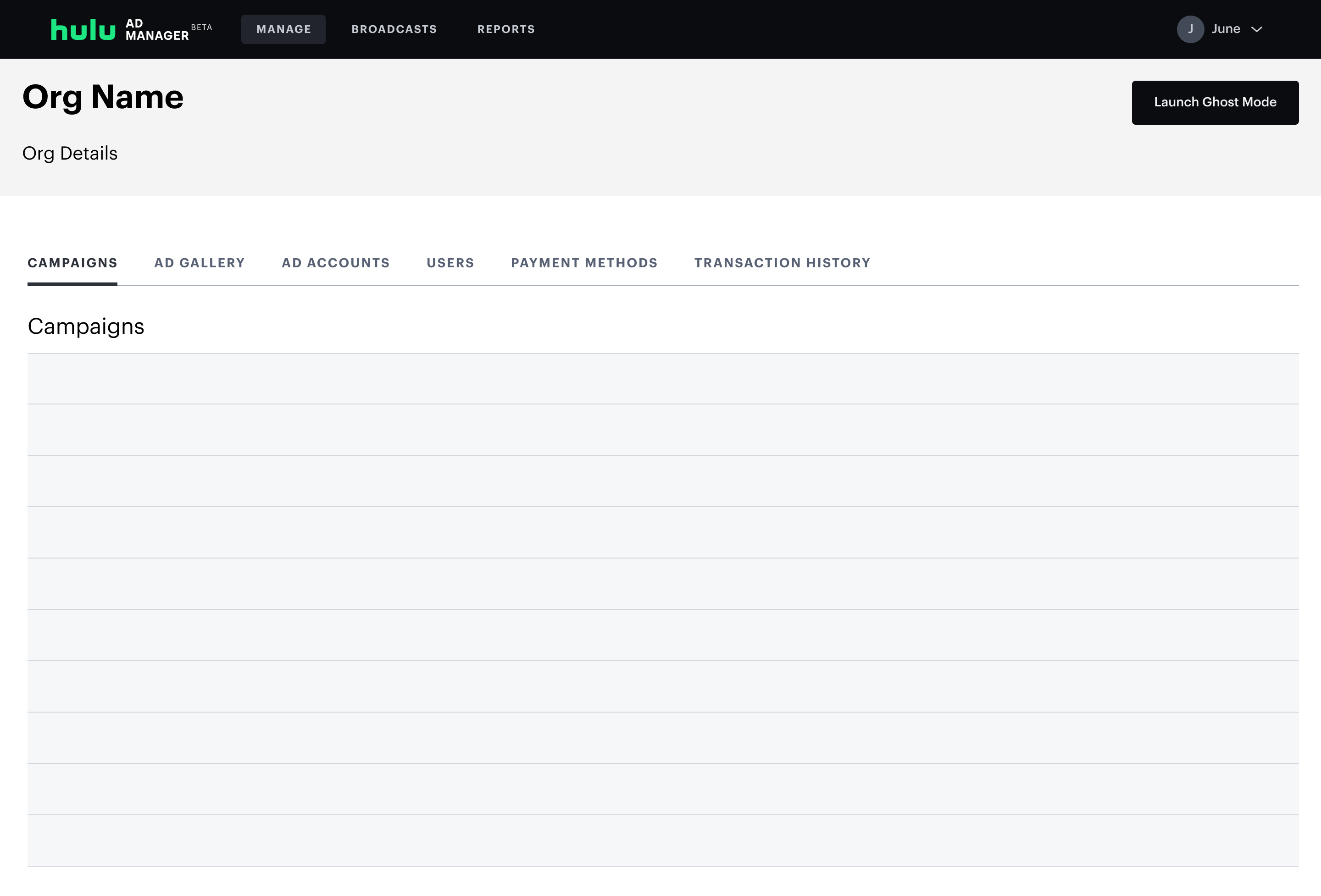
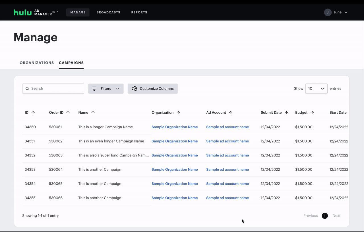
Users had a long list of requests: campaign budgets, performance pacing, audit logs, column customization. I mapped what was critical for launch vs. what could be pushed later. I designed the tab structure to be scalable so new views could be added without restructuring the whole navigation.
Ghost Mode: Solving the Screenshot Problem
The screenshot workaround revealed a deeper problem: support teams had no way to see what an advertiser was actually seeing.
After scoping feasibility with product and engineering, we designed Ghost Mode: accessible directly from any advertiser's page. It let an admin view an advertiser's exact account view, campaigns, settings, and UI. Admins could also make edits directly from within the platform.
Tradeoffs & Decisions
Once I had a working prototype, I ran multiple rounds of feedback with admin users. The response to the overall direction was positive: the tab-based structure immediately felt more familiar and less disorienting than the current layout.
The detailed feedback surfaced four main requests:
- An Audit Log to track changes other admin users had made
- Better discoverability of horizontal scrolling in long campaign tables
- The ability to show, hide, and reorder table columns
- More campaign performance data surfaced directly in the table
What I Prioritized and Why
The Audit Log was deprioritized for launch, because it required backend infrastructure that wasn't scoped into the release. I documented it clearly as a post-launch priority so it wouldn't get lost, and it was picked up in a future sprint.
The Audit Log was deprioritized for launch — not because it wasn't valuable, but because it required backend infrastructure that wasn't scoped into the release. I documented it clearly as a post-launch priority so it wouldn't get lost, and it was picked up in a subsequent cycle.
Outcome
The Admin Portal launched in early 2023. The platform has since been rebranded to Disney Campaign Manager. New features have been added, but the tab-based navigation structure I designed remains as the foundation.
Here are a few of my takeaways:
Escalation tickets dropped 28% in the months following launch, a direct result of support teams being able to investigate and resolve issues faster. Additionally, Ghost Mode enabled white glove account managers to work entirely within the platform, eliminating reliance on third-party tools.
If I were to revisit this, I'd invest more in the scalability of the tab structure. The current design handles the present feature set well, but as the portal grows, there will be too many tabs. A future iteration might explore a dashboard-first model that surfaces the most critical information upfront.