Background
VAST (Video Ad Serving Template) is the industry standard for managing video ads across different platforms.
An agency creates a VAST tag containing their creative, tracking pixels, and metadata.
One tag works across dozens of ad platforms simultaneously. When the tag is updated, it's updated everywhere automatically.
Disney's Campaign Manager (the company's self-serve ad platform) did not have this feature.
Problem
-
01
Campaign Manager was built for SMB advertisers (small to mid-size businesses) managing a handful of small campaigns manually.
-
02
From 2022, Disney was actively pushing to cater to the agency market, a segment that generates significantly higher revenue.
-
03
Agencies run campaigns at a scale that manual workflows could not support.
VAST was the easiest way for agencies to manage creatives across dozens of platforms simultaneously.
In Campaign Manager, they would have to manually upload the creatives, and every revision meant repeating that process.
Having a way to manage VAST tags in the platform was a common request from customers. I heard it directly on a call with an agency prospect:
When the answer was no, it typically became a deal-breaker for agencies. Without VAST, Campaign Manager wasn't a viable option.
The business case was clear: add in VAST. What wasn't clear was how to build something agencies could use to validate and process their tags on their own successfully.
Discovery & Scope
The initial requirements were vague:
- Create a VAST upload feature.
- No specifics of how to "check" VAST tags.
- No specifics on how to display creative assets once ingested.
To learn more about VAST, I spent time with the sales team and learned how tags behave, and what can go wrong.
After looking at all the patterns in the platform, I went with the existing Ad Upload flow. I wanted any VAST experience to feel like a natural extension of it rather than a brand new pattern.
Before touching Figma, I mapped every action and touch point in the flow:
My main considerations:
VAST tags would have to go through Disney's tech specs but also legal's requirement of using tags only from approved vendors.
There were many reasons why a tag gets rejected, and I would need a simple way to explain those reasons.
We had a specific timeline to meet while we were doing an overhaul of the entire platform and I was sole designer.
Designs
First concept:
This design included:
- Familiar pattern — Same interaction as Ad Upload, but users paste a VAST tag instead of uploading a video.
- VAST validation — Platform checks the tag against an approved vendor list and flags any formatting issues.
- Pass/Fail flows — Validation pass → preview screen. Fail → clear error explaining what to fix.
- Preview screen — Shows visual assets from the tag and surfaces review status.
While figuring out how to handle validation, I found a legacy tool called "VAST Checker" which was originally built for external partners to validate tags against Disney's tech specs. I decided to reuse its table component since tech spec rejection was a common complaint, and I hypothesized users would want to see exactly what the issue was.
My first hypothesis was that showing the full table with all the validations would give agencies the knowledge to fix the tag themselves.
However, the table had 14 rows, dominated the layout, buried the pass/fail signal, and made the screen feel like an audit report rather than a helpful step.
My second hypothesis was that moving the tab menu to the side would reclaim vertical space and give the table breathing room.
It helped, but didn’t solve the underlying problem. The table was still dominant, and was causing too much cognitive load. Users still had to scan all 14 rows to find what actually needed fixing.
I brought the second iteration to ad ops and account managers (the internal teams who work directly with advertisers and know agency workflows). Their feedback reframed what I was actually solving for.
-
01
The layout still felt busy. There was too much data on screen at once, even with the side tabs.
-
02
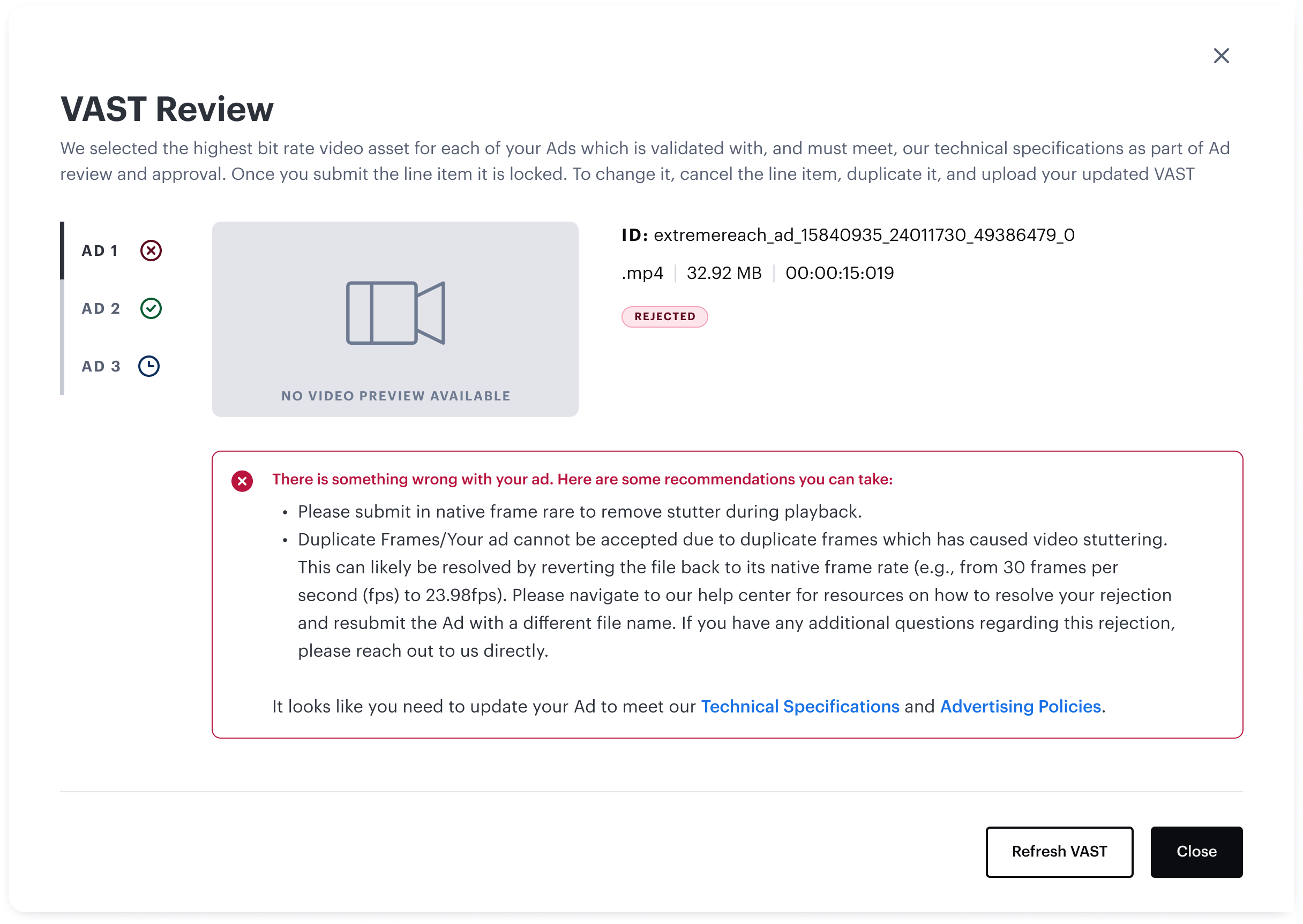
Users had to click into each tab to find the status (Approved, Pending Approval, Rejected) of each asset.
Agencies don’t need to see every spec that was validated. They need to know what’s wrong and what to do about it.
I stripped the table down to failing specs only, and added a status indicator on each asset tab so the status was visible at a glance without clicking through.
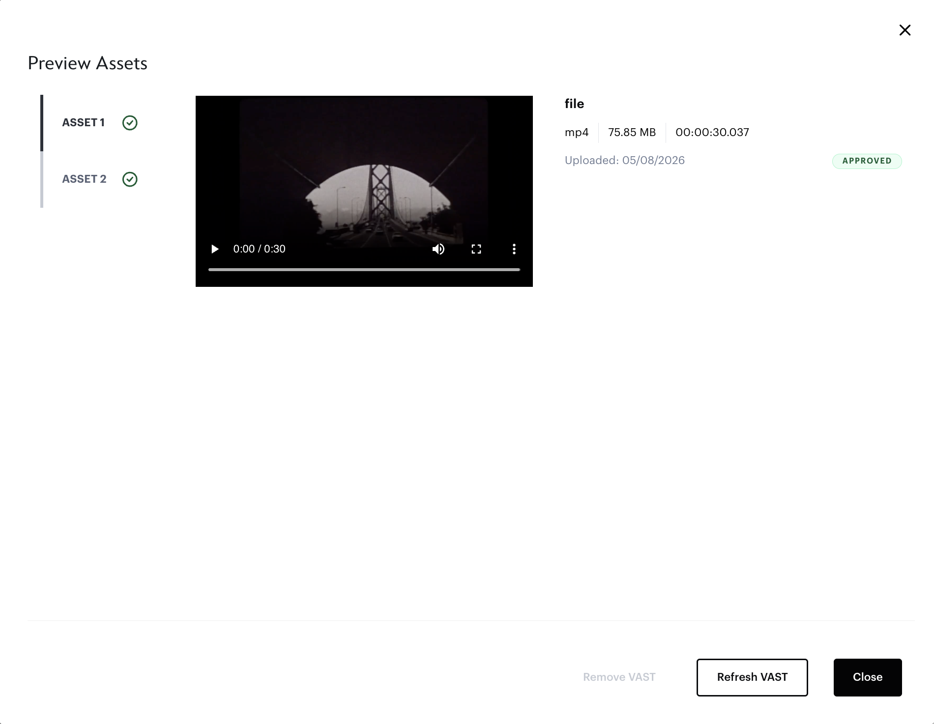
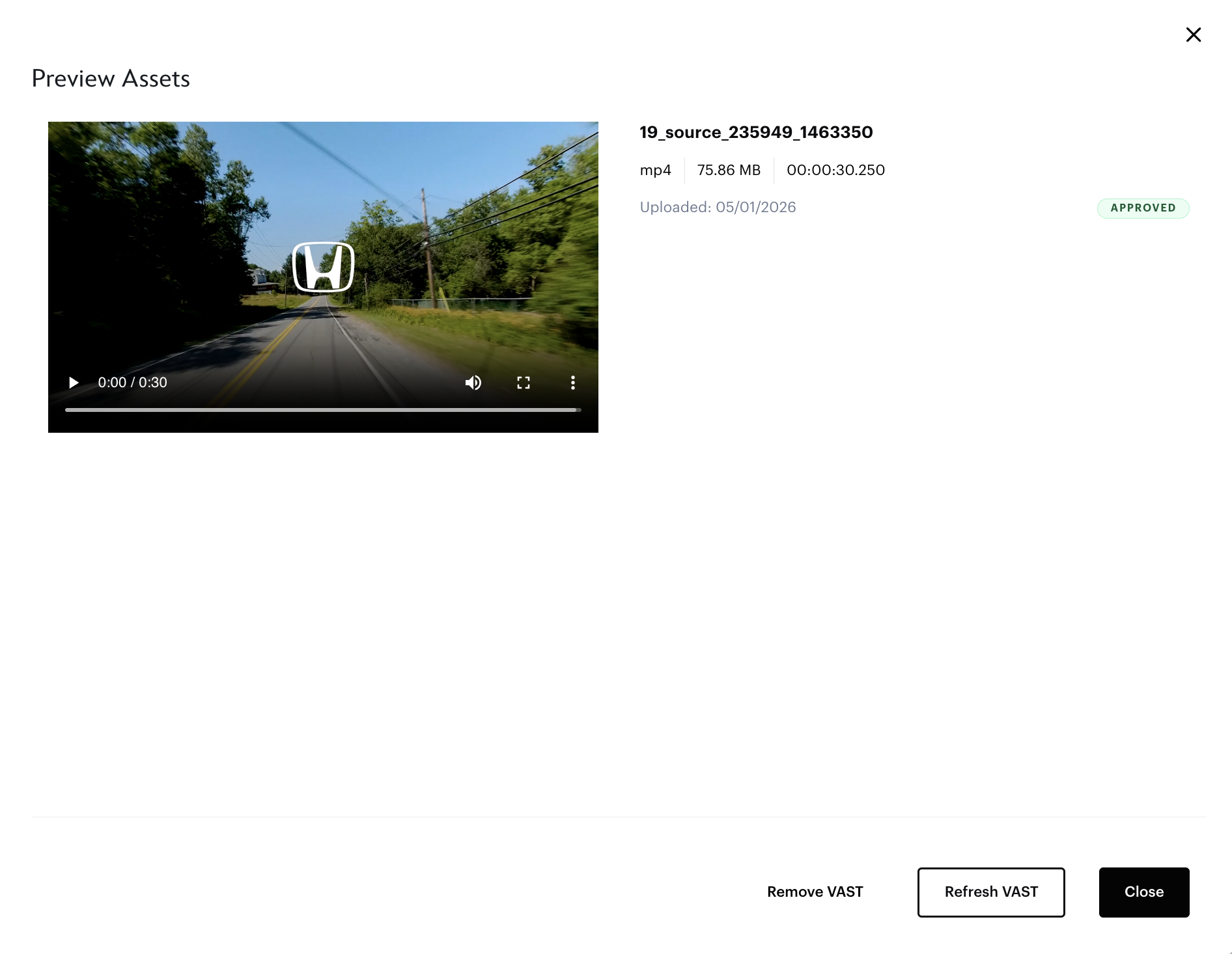
With the core layout resolved, I mapped out every state a user could land in. These are screens pulled directly from the platform:
Any ingested VAST would show the video preview and any tag with multiple assets would have the sidebar nav with status icons.
Even if VAST passes tech specs it can still be Rejected (such as having brand mismatch or Standards & Practices violation).
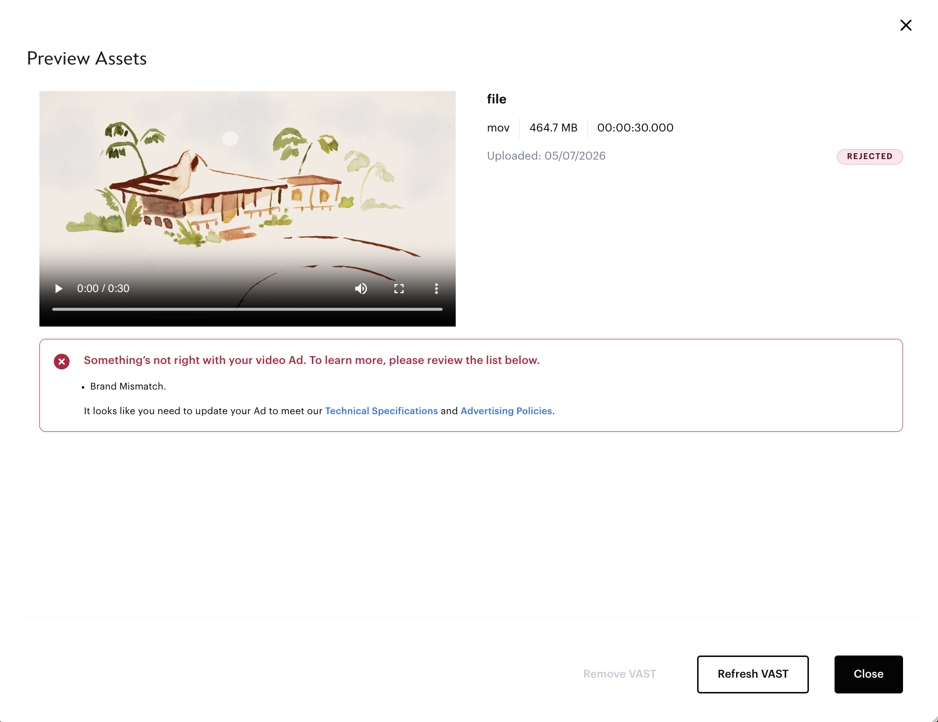
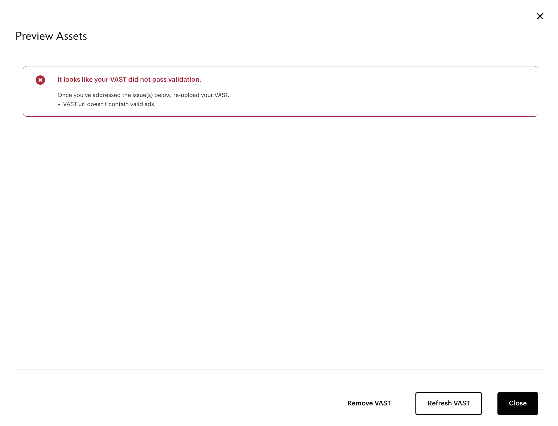
To prevent an invalid tag even being ingested in the first place, an error appears preventing user from going to preview screen.
This can include formatting errors or using a VAST tag from an unapproved vendor.
The final design, shipped Q1 2024:
Outcome
The feature launched on time and helped increase agency usage of the platform. A few reflections:
VAST was new territory for me. I learned not just what VAST is, but how it fails in practice and what I can do to prevent those fail states.
If I could do this project over again, I would involve ad ops/ad sales earlier, ideally in the first concept review rather than the third iteration. They had the clearest picture of where agency workflows break down, and their feedback reshaped the layout significantly.
The hardest call was the validation table. I believed (and still do) that showing the list of specs is valuable, even for technical agency users. But it was solving for the wrong moment in the flow. Agencies have already built their tag out, they didn’t need a full audit; they need to know what’s wrong and how to fix it.
Cutting the table down to failing specs only was the right tradeoff, even though it meant removing something I’d deliberately designed.
Along with the implementation of VAST and the greater platform redesign I led, we saw significant growth in Campaign Manager the following years.