Background
Hulu Ad Manager (now Disney Campaign Manager) launched in March 2020, giving advertisers a self-serve way to create and manage streaming campaigns.
At launch, the platform ran on a single fixed CPM (Cost per 1,000 impressions). Every advertiser paid the same rate, regardless of targeting sophistication, deal type, or seasonal demand.
One CPM made sense when the platform only served SMBs. But as it grew, having a flat pricing structure led to issues:
Couldn't charge more for advanced targeting like geography, demographics, or interests.
No way to offer promotional rates for agencies, repeat customers, new advertisers, or large accounts.
No way to adjust pricing based on seasonal inventory/demand.
Beyond the missed revenue opportunities, there was an additional problem. Pricing had to make an engineering ticket and wait a few weeks to update the CPM. Additionally, the pricing team manually tracked advertisers and rates via spreadsheets:

Requirements
The idea was obvious: give the pricing team a self-serve tool to create and manage multiple rate cards without engineering support.
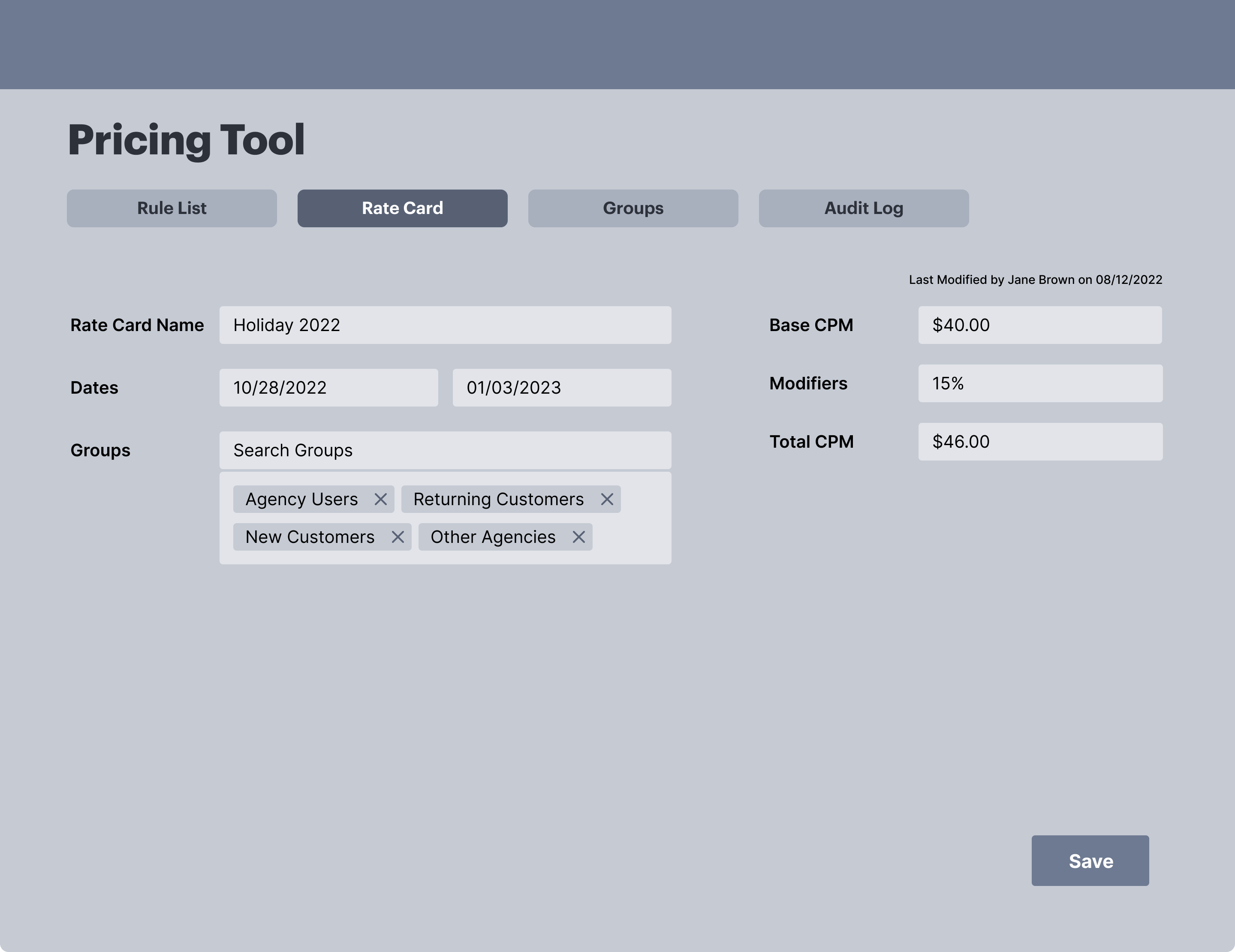
The core design challenge wasn't just building a CRUD interface for rate cards. It was building a complex system that felt simple and manageable for non-technical users. Rate cards needed flexible logic: start and end dates, pricing add-ons for targeting, priority ordering when multiple rates applied, and a way to assign advertisers to a rate card.
Ability to adjust dates and premium pricing add-ons such as targeting, geolocation.
Identify different rate cards for distinct pricing models — e.g., "political" or "standard".
Higher-priority cards override lower-priority ones when multiple cards apply to the same advertiser (or which has the lower rate).
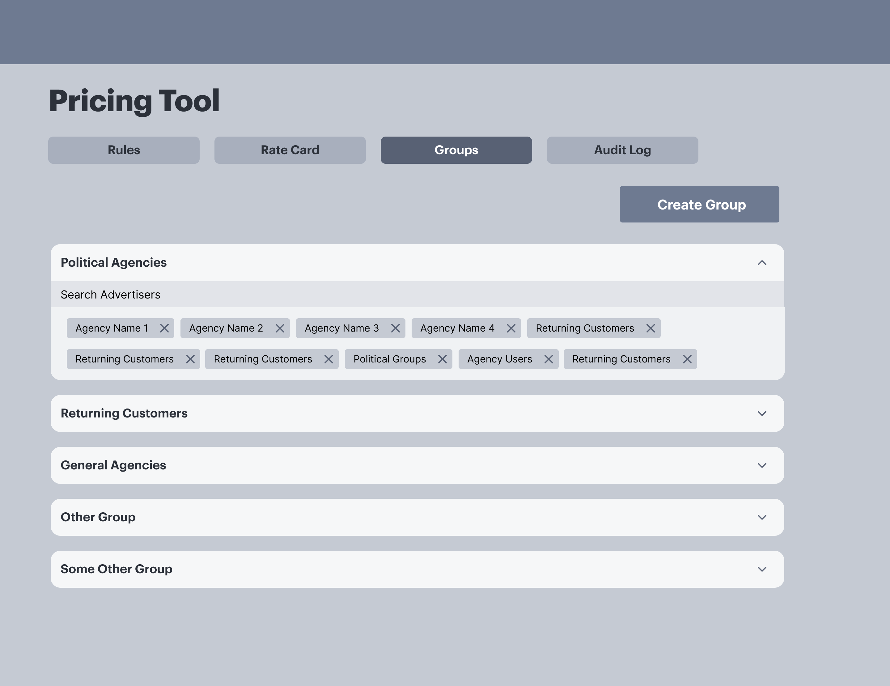
Let users create and manage advertiser groups, enabling them to bulk apply pricing to one group rather than each individual advertiser.
Discovery & Designs
With a compressed timeline (about 5 months) I focused discovery on the people who would use this tool every day. Through interviews with the pricing team, I learned how they tracked rates, and how they made decisions about which advertisers got which CPMs.
The biggest insight wasn't about features, it was how they worked. They thought about their work in terms of rate cards as objects you manage in a list, not forms you fill out one at a time. That informed the core layout.
Learning from Internal Precedents
External competitive research wasn't possible for this internal tool. Instead, I audited two existing tools in our ad suite with comparable complexity:
Deal package management tool
Used a table + side panel pattern the pricing team already knew, reducing the learning curve for a new tool.
Legacy linear TV rate card system
Too much information on a single screen, no clear separation between viewing and editing states.
Initial Design Explorations
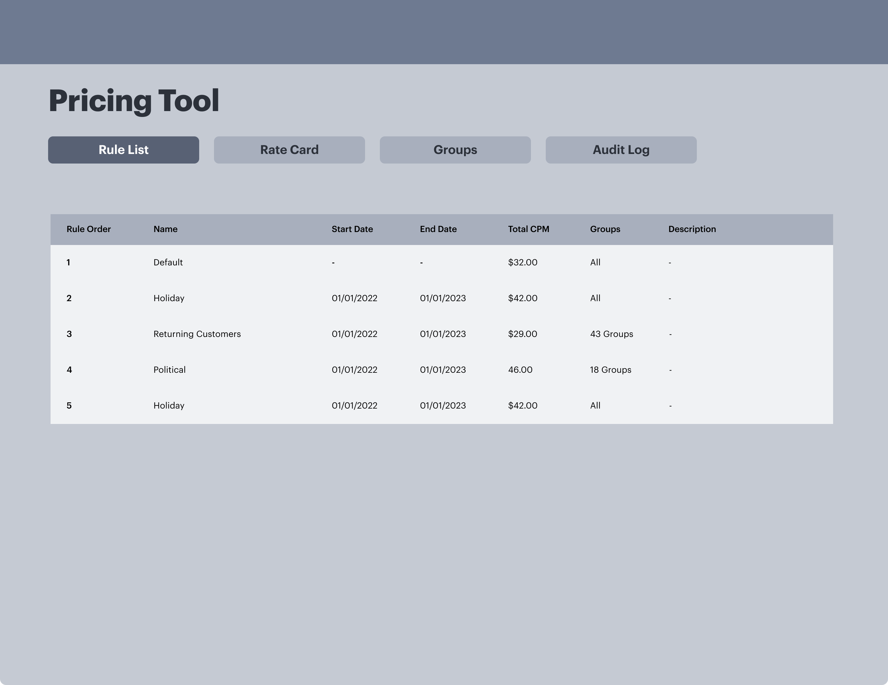
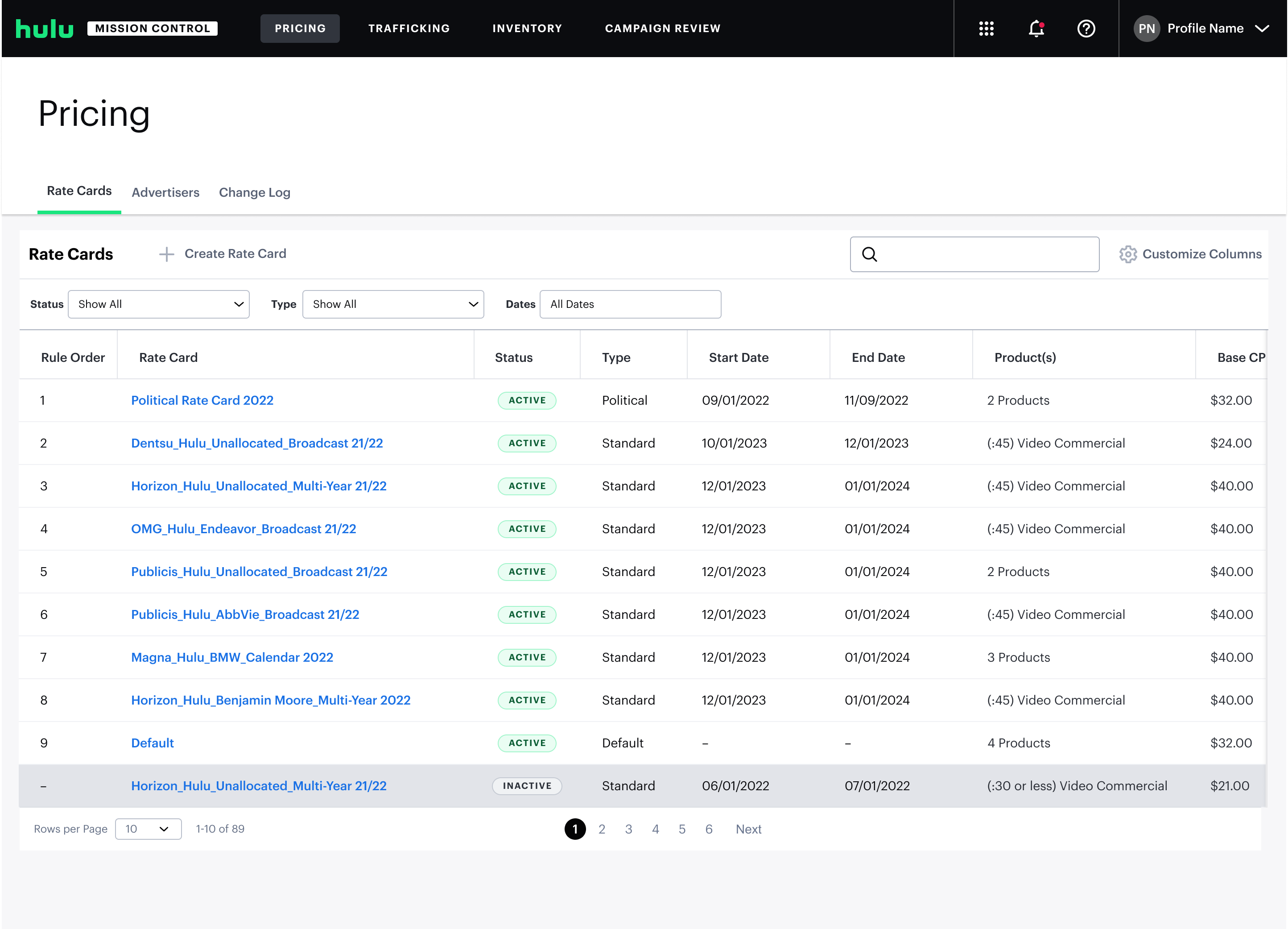
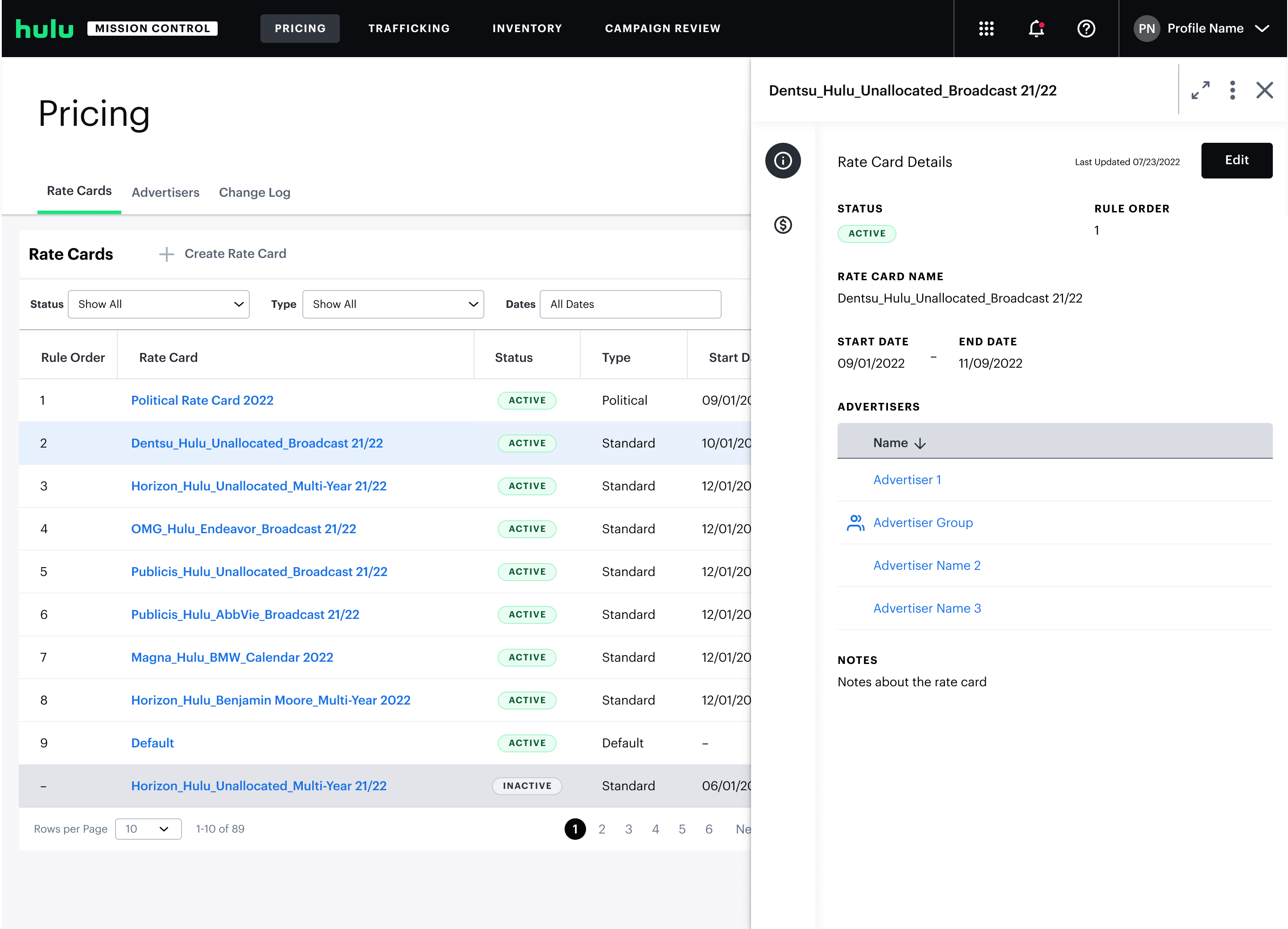
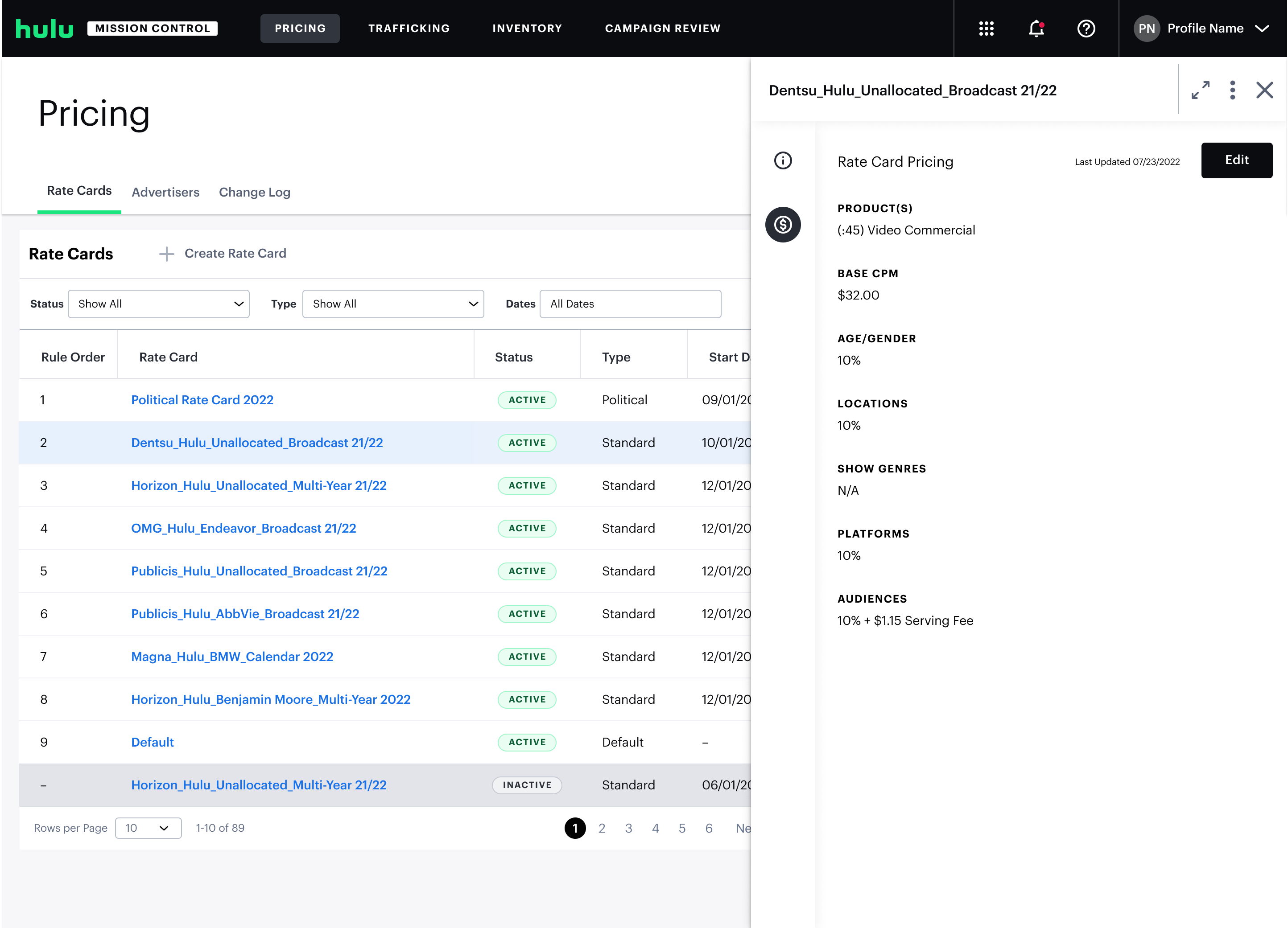
The final interface uses a table view with an expandable side panel for editing.
My initial instinct was to avoid another data table — pricing logic was complex, and a guided form felt like it would simplify the experience. But after watching how the pricing team worked in their spreadsheets, I realized matching their existing mental model mattered more than imposing what I thought was a cleaner pattern.
Key Design Decision: Table + Side Panel
The final interface uses a table view with an expandable side panel for editing — a deliberate choice over a full-page edit flow.
- List stays visible — the pricing team could compare cards, check active dates, and understand priority order without losing context.
- Consistent pattern — select a row, edit in the panel. I carried this into advertiser groups so the whole tool felt like one system.
- Quick Iterations — Created regular working sessions with the pricing team in place of formal testing.
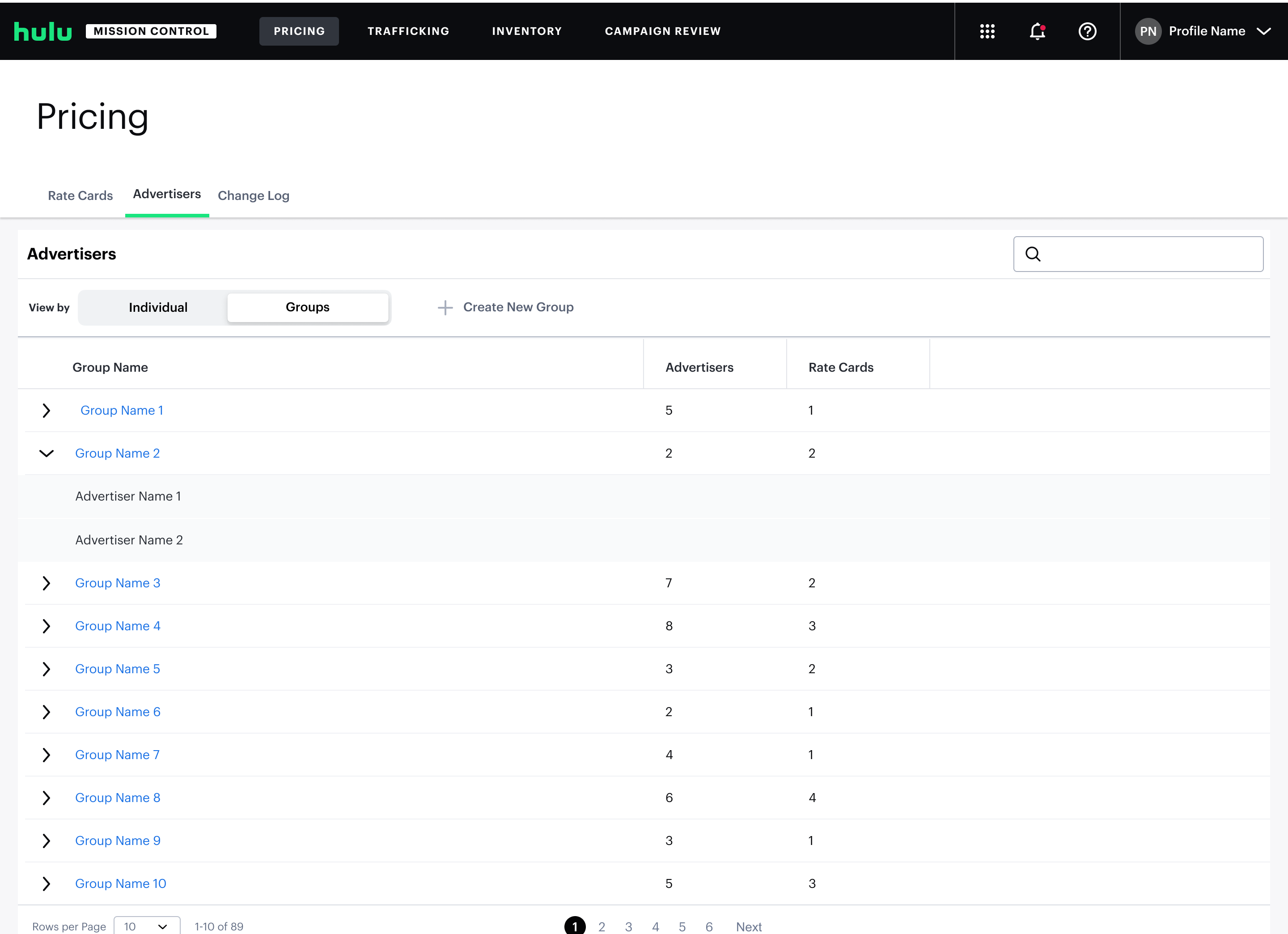
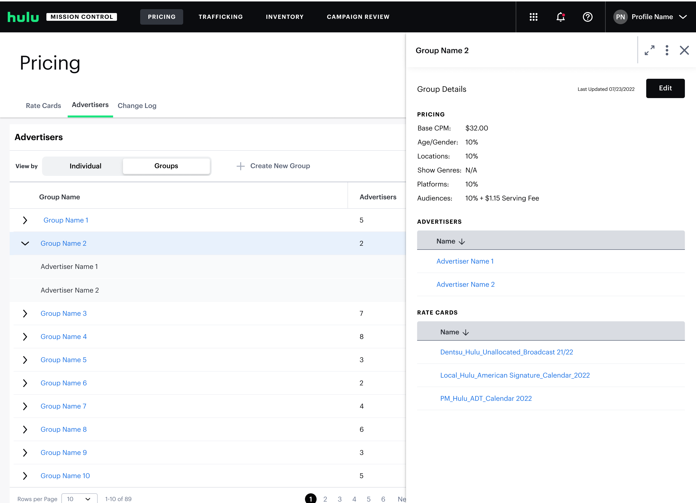
Advertiser group management uses the same table-and-panel structure.
The consistency was intentional: once a user understood how to work with rate cards, advertiser groups should feel immediately familiar. It also reduced the cognitive overhead of learning two different interaction models in the same tool.
Final Design
The walkthrough below shows full user flow editing rate cards and advertiser groups.
The pattern has scaled. Since launch, the team has used the same pattern to add more pricing variables such as: ad length, day parting, type of content.
Takeaway
Pricing tool launched in early 2023 and had replaced a process that previously required engineering tickets and weeks of wait time. Here are a few things I took away from this project:
The hardest call was choosing a table layout over a guided form, despite my instinct to avoid another data table. Matching the team's existing mental model ended up mattering more than imposing what I thought was a cleaner pattern.
If I were to revisit this, I'd take another look at the side panel. It was the right call at launch, but with all the pricing add-ons the team has layered on since (commercial length, day parting, content type), it's probably starting to strain.