Background
At McGraw Hill Education, the platform included a scoresheet feature that automatically graded online quizzes, tests, and homework.
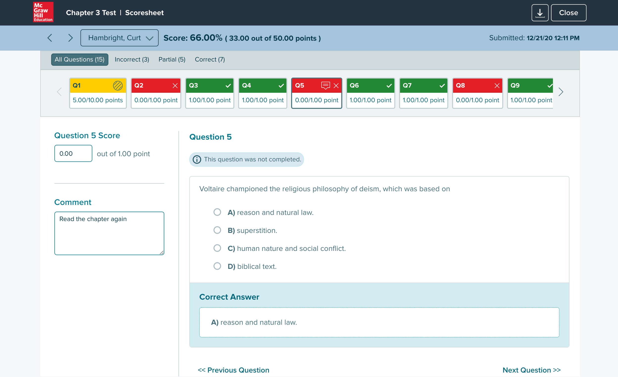
For older students, that worked well. But K5 teachers operated differently — they created tests and quizzes in the platform, then printed them out for children to take by hand. Auto-grading didn't apply to them.
After collecting completed tests, teachers had to manually enter every score into the platform to unlock performance reports. Without that data, they couldn't see which students needed remediation or which skills to revisit.
The entry process was sequential and slow — one question, one student, one click at a time. For a class of 25 with a 10-question test, that's 250 individual inputs before a single report could run.
Concepts
The real question wasn't just how to make entry faster — it was what mental model to design for. Teachers grading paper tests already had a workflow. The design needed to match it, not fight it.
An early idea was to let teachers upload a spreadsheet that would auto-populate the scoresheet. Most teachers tracked scores in spreadsheets anyway, so it fit their existing behavior. Stakeholders were on board — but it was out of scope for the initial version.
With spreadsheet upload off the table, three core requirements defined the design problem:
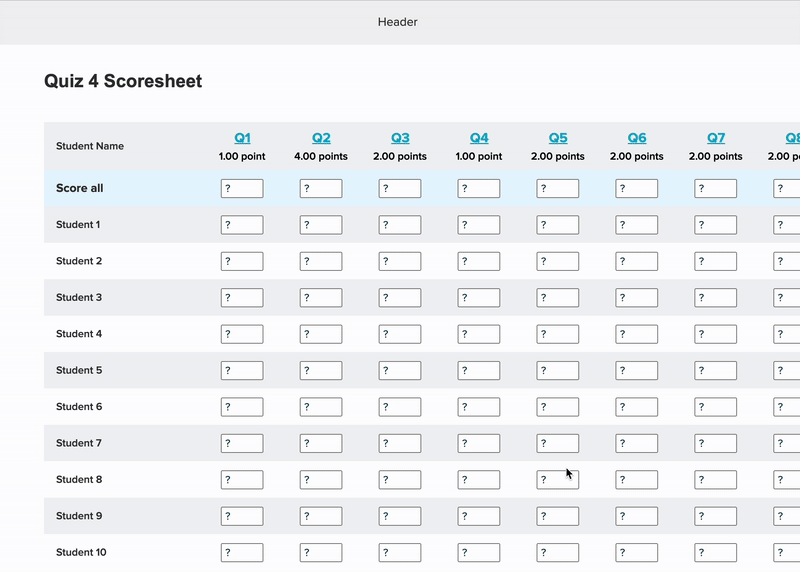
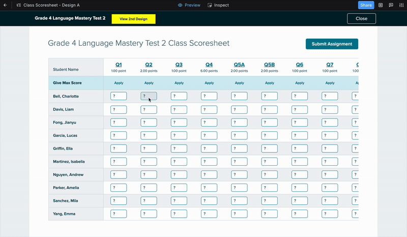
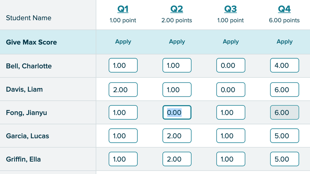
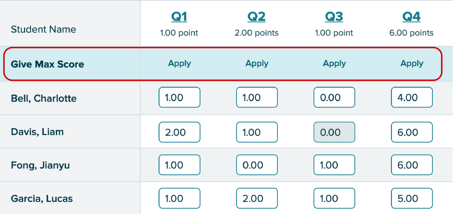
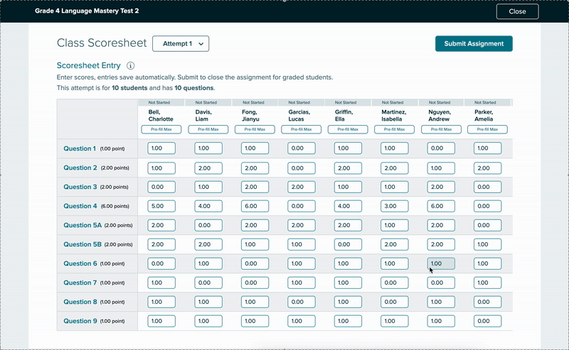
Score an entire class at once, not student by student.
Fill max score across all students on a question in a single click.
Allow scores above 100% for extra credit assignments.
The spreadsheet layout gave teachers a full class view at a glance — easy to scan and compare, and familiar enough to feel immediate. The tradeoff was navigation: with many students or questions, it could get overwhelming to track which row you were on.
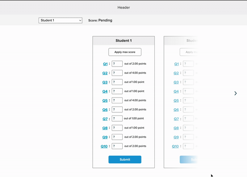
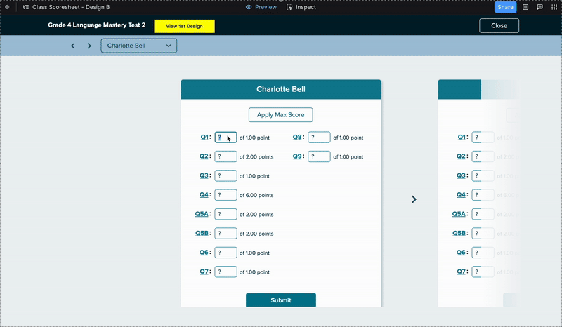
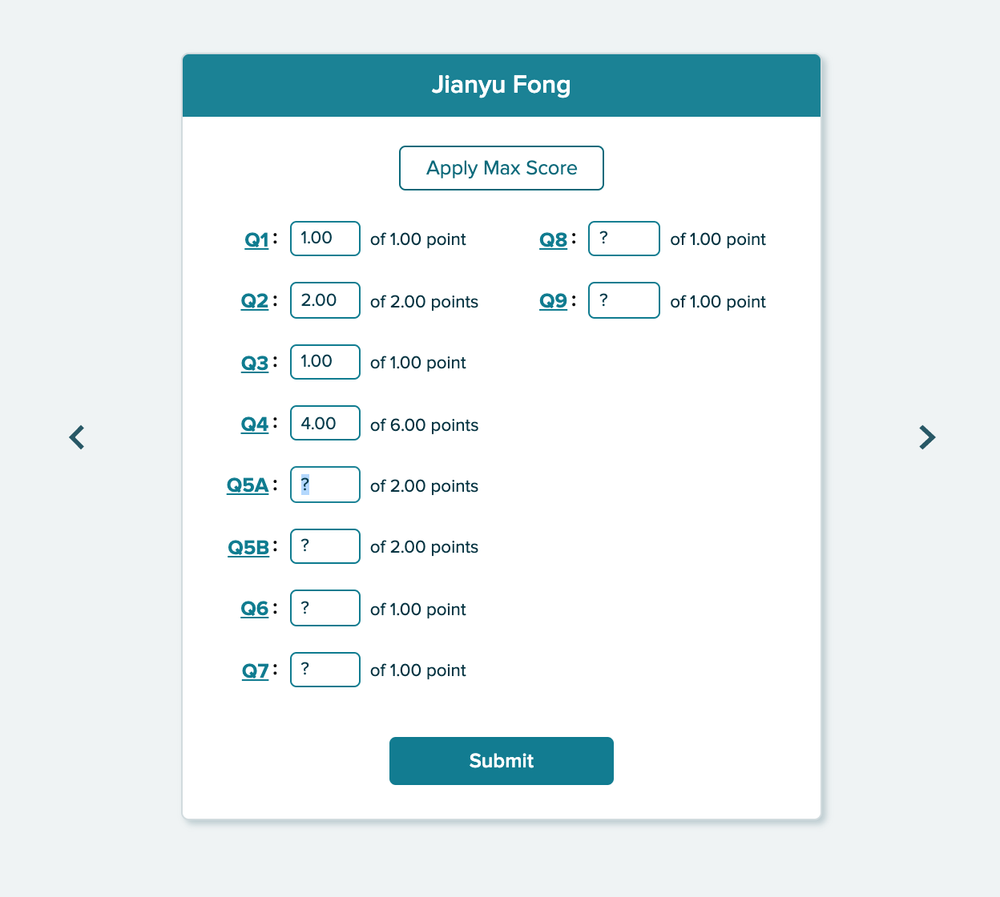
A second design took the opposite approach: one student at a time, focused entry, mimicking the physical act of picking up a test paper and working through it.
Design A was faster for getting a class-level overview. Design B matched how teachers actually moved through a stack of papers. Rather than debate it, we built both and tested them with real teachers.
User Testing
Catching a Core Issue Early
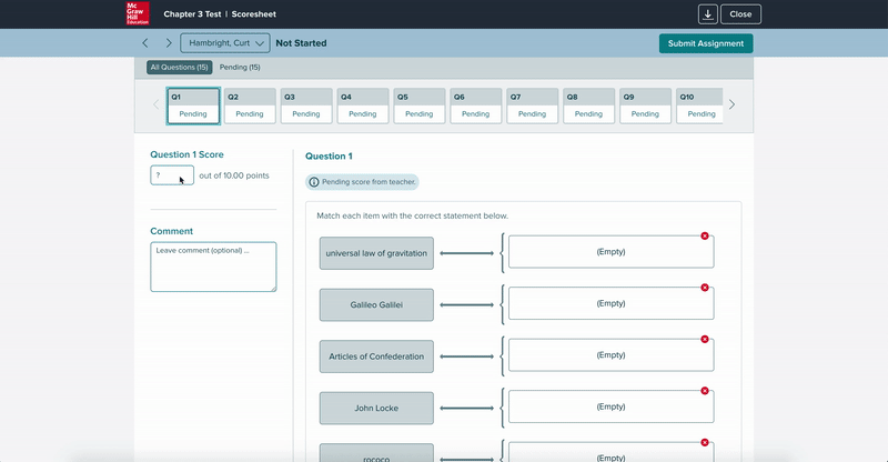
Before formal testing began, our research team ran a pilot session with a single K5 teacher. Watching her work through Design A, I noticed something immediately: she was fighting the layout. The spreadsheet expected her to move question-by-question across columns — but she kept trying to move student-by-student down rows.
"It would be nice if it [the design] was going down vertically here as well, instead of horizontally, it would just looking up and down on here. It's almost harder for me to go up and down and then track horizontally."
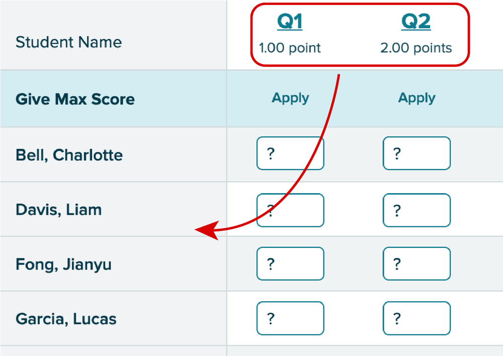
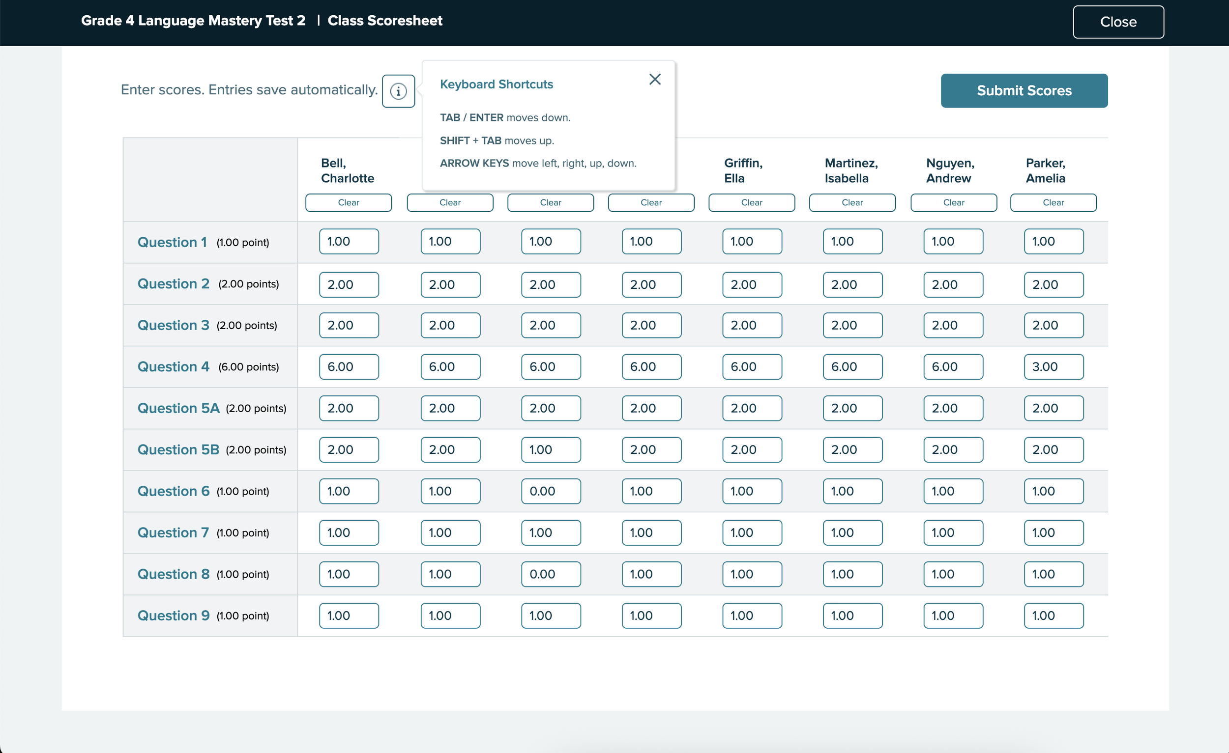
Teachers grade paper assignments student-by-student, not question-by-question. The spreadsheet's axis was reversed from how they actually worked. Based on this, I revised Design A to flip the orientation: questions down the left column, student names across the top — matching the direction teachers naturally moved through a stack of tests.
Our Testing Approach
Our research team recruited seven K5 instructors with experience across two major products — Reading Mastery and Reading Wonders — all familiar with the existing online scoresheet.
Each participant tested both designs: the revised spreadsheet layout (Design A) and the student-by-student view (Design B).
To simulate real grading conditions, participants were given PDFs of three pre-scored tests — open on a second screen or printed — and asked to enter scores for those three students into each prototype.
Feedback
Spreadsheet Design
Tab and Enter made entry fast — but participants didn't discover them until they stumbled on them. A discoverability fix, not a design flaw.
Every participant asked to mark absent or excused students before submitting — what seemed like an edge case was universal.
Consistently missed on first pass. Once explained, everyone wanted it. The concept was right — the label wasn't.
"I do like the format of this and makes it easy to put in and I imagine it would be even faster if I wasn't necessarily looking at a scanned document like toggling back and forth. I think that would be easier."
"So what I liked about it is that I clicked on it. Put a number, enter. Next one number enter number enter number entry, like it was it was quicker. It was a lot easier."
"The Apply button...I would think would just be to lock the score before you submit it. But I honestly visually. I just as you can see, I totally skipped over that."
"Yeah, I like that. I just didn't even see that there where it says give max for but now that you pointed that out to me it makes perfect sense."
Student-by-Student Design
Design B made the "Apply" button clearer and reduced cognitive load. But two consistent issues emerged:
Most participants wanted to see the whole class at once — the single-student view felt limiting for gauging overall performance.
Paper tests aren't sorted alphabetically. Teachers had to hunt for each student's name — friction that Design A's visible row labels avoided.
"I honestly almost even like this better from a type A personality perspective, because if I've got Lucas in front of me. Then I'm just looking at his score sheet. And I don't feel like I have all the other names and everything around me. But I mean, I do like both."
"It's hard to say. I like the previous one better, that we just submitted...and I think that I liked on that you just start at the top and you just go down to input all the scores."
Revisions
5 of 7 participants preferred Design A. When asked what would make it better, teachers named the same four things:
Ability to exclude specific students before submitting the full class batch.
Displaying overall scores or class averages alongside individual entries.
Highlight high and low scores visually to surface struggling students at a glance.
Show the skill or standard tied to each question to help guide targeted remediation.
What I Updated Before Ship
Renamed and restyled so teachers immediately understood its function.
Added an info icon surfacing Tab and Enter navigation that participants kept missing.
Teachers can now mark students absent or exempt before submitting the batch.
"Submit Assignment" → "Submit Scores" — more accurate to what was actually happening.
Visual confirmation showing which scores had been successfully submitted row by row.
The final design after all testing rounds:
Insights
The strongest signal from testing wasn't a preference split — it was the emotional response. Teachers weren't just giving feedback on an interface. They were reacting to years of friction finally being acknowledged.
A few things they said during sessions:
"Um, I just want to say thank you for changing this because last year was, it like I...would I would do this on a weekend because it would take so long."
"A definite improvement over what we've had, I think what we've had not only isn't that easy to use, but I think it looks really outdated, which turns people off."
The Class Scoresheet wasn't shipped. Priorities shifted and resources moved elsewhere — a real and common outcome in product work. But the design was validated: seven teachers tested both concepts, five preferred the revised spreadsheet layout, and every participant left with a clear picture of what they needed.
What this project reinforced: the pilot session insight — that the axis was wrong — is exactly the kind of thing that disappears when research isn't treated as a real deliverable. Catching it before formal testing meant seven sessions of clean, focused feedback instead of seven sessions trying to diagnose a structural flaw. That's what research is for.